FINAL PRODUCT


Final Music Magazine:
Front Cover
Contents Page

Article Spread


Flat Plan of my Article Spread

Flat plan of my Contents Page

Flat plan of my Front Cover

Skills developed from technologies

Development of my magazine - Looking back at my preliminary task, what do you feel you have learnt in the progression from it to the full product?

What have I learnt about technologies from the process of constructing this product?

Throughout constructing my music magazine I have used many software programmes and learned how to use tools correctly, which would help me create a professional product in the end.
Before this process I have never had to capture professional photographs, therefore this was a real challenge for me as I did not have the knowledge or skills to do this. I learned that in order to achieve a high quality image the lighting had to be accurately placed.

Original image:
This image shows a great use of lighting, as it is placed directly above her face, creating a glow over one side of her face. This emphasises the models, make-up and makes her eyes stand out, which will attract the reader’s attention. 
Her hair however would need editing as it is not been placed evenly and gaps appear in sections of it. I was able to fill in the white background of her hair using the ‘clone’ tool. This tool allowed me to copy other sections of her hair and paste them into the gaps that needed filling, making her hair look fuller and making the image seem .

To cut the image out I used the ‘crop’ image to cut out all the unwanted background, then I used the ‘magnetic lasso’ tool to cut around the selected image precisely, that I wanted to use. This allowed me to highlight the parts I thought looked professional and I was able to remove the odd strand of hair that looked out of place, by using the ‘magic eraser’ tool, as this selects the bits that were not part of the main image and deleted them.

I also changed the brightness and contrast of the model's hair, as I still wanted the hair to look a natural colour, but I wanted to emphasis it to make it look glossier so it would attract my target audience.
I edited her eye colour and make-up (eyeliner and lip-gloss) by selection the ‘paint brush’ tool and decreasing the ‘opacity’ level down to 15%, this allowed me to selected a similar colour to the original but highlight it more to make it stand out and make it more noticeable, as the eyes need to catch the buyer’s attention and you could not see the make-up colour very well on her lower lip, therefore I highlighted the edges to make the photo seem more professional.

When I put the image on my front cover I was able just to simply expand the image using the ‘transform controls’ and the select tool, this kept the image to a high quality but enlarged it to fit my full page, as this would appear as the main feature of my front cover, as after the editing the image seemed professional, attractive and persuasive.

Analysis of my music magazine

How did I attract my audience? (Article Spread)


Check this out on Chirbit

How did I attract my audience? (Contents Page)


Check this out on Chirbit

How did I attract my audience? (Front Cover)


Check this out on Chirbit

Who would be the audience for your media product?

What kind of media institution might distribute my media product and why?

Distribution of my music magazine:

My music magazine would need to be largely promoted, along with the top music magazine, especially ones with a similar structure and genre, as this is my competition and I want the target audience to purchase my magazine more rather than my competition, as this would increase the popularity of mine and perhaps develop the audience for my magazine into an older or younger age group, rather than just young adults.

I have researched into a media company called 'Bauer'. Bauer is a media advertising production company that allows magazines to be advertised and promoted professionally, with new technologies and to a high standard.

The company already has production contacts such as:
- Q
- Mojo
- Kerrang!
- Pop
- Grazia

Three of these are top music magazines right now (Q, Mojo, Kerrang!), and my magazine is based around Q as it is my base style model, therefore this media company would be suitable to promote my product, as it has worked with a similar magazine in the past. Also, Grazia dominates the fashion magazines, therefore I know this company is reliable as it has promoted great magazines that are now at the top of their genres and very popular with various different audiences.

However, the only competitor with this company is 'Q' therefore I think my media product would be successful as there are not many other music magazines with a similar style or genre, as most the magazines with this company are rock or pop.

My style models for my music magazine product

Front Cover:


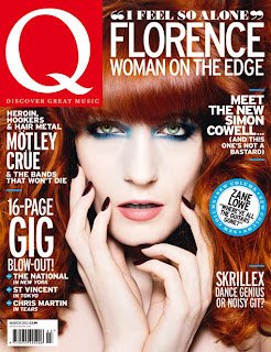
I have decided to base my music magazine on 'Q', as we have a similar target audience and genre, which is young adults (18+) and an alternative music genre. The image on the front cover of 'Florence' takes up the full page which tells the reader that the artist will largely feature in the magazine. The main colour scheme consists of black, white, blue and red. By having a colour scheme that runs throughout the magazine it allows the reader to see that it is professional and has been carefully produced.
The layout of the page is set clearly and organised, which would appeal to a more sophisticated target audience than a structure being an organised mess would, as all the text is easy to read and the colours are bold but not all too bright. 
Front Cover
Contents Page:


The contents page I will be focusing my magazine on will be the right hand side of this style model, as it is full of detail but still clearly structured, as the pictures are aligned and detailed with page numbers on them which allows the reader to link the artists to certain pages that they feature on. The actual text is telling the reader the contents of the magazine, which is laid out down the right hand side of the page in a neat column with subheadings. This is organised so that the reader can view the page and automatically know which story is on what page. Also, the brief descriptions under each story allows the reader to have an initial impression of what it is going to be about.
The main colour scheme matches the front cover with black, white and red, as do the fonts, as the title fonts are bolder than the fonts used when listing the stories in the column which will appeal to the audience as it is appealing and looks professional.
Contents Page

Article Spread:


The colour scheme again follows the front cover and the contents page as it shows that the magazine pages are all linked together and tells the reader that it is a professional magazine that has been created well. On one page a large main image is used to indicate to the reader who the article or interview is about. 
Quotations are used to show the reader that the artist/band has actually taken part in this article and it has not just been made up by a reporter only. The quotations may attract the reader to view that particular story as the quotes are normally, revealing secrets or shocking news to influence the viewer into reading the full article.
Banners of the three colours in the scheme are used at the top of the pages, which have titles and headlines place in front. The contrast of the three colours working together makes the font more noticeable and would attract the reader into viewing the main story.   
Article Spread

In what ways does my media product use, develop or challenge forms and conventions of real media products?

My media product uses many key features of my style models which are real magazines such as:

* Colour Scheme - My colour scheme is black, white and red, which are similar to my style models as they are the colours that my target audience said in the questionnaires they were attracted to when it comes to purchasing a music magazine, therefore I have concentrated mainly on these three colours to make my product seem professional and suitable for my target audience of young adults.

* Images - My main front cover image has been developed from my style model as the photo of 'Florence' dominates the page, therefore I decided to use a close up image of a female and used her face and hair as the background to my front cover similar to my style model. However, I developed it by producing a softer image  as I edited the photo naturally rather than completely editing all the colours of the image like 'Q' has done, as my I did not want a harsh image as the tagline to her story links to her picture.

* Layout - My layout is the typical convention of a music magazine of this genre such as 'Q' as I did not want an organised mess, as the target audience revealed they wanted a clear layout where all the text could be read easily. Also, the main image is the centre of my layout therefore the text and shapes had to go around it which centralises the main story being about that specific artist.

* Genre - My decided music genre was alternative music which is the same as my style model as it allowed me to express this genre through the use of my colour scheme, images and text.

Analysis of Music Magazines

What I have learned from my preliminary project

While producing my school magazine I learned new skills on photoshop, as I was constantly cropping pictures to  make them fit the scale I needed. I discovered these by experimenting with the different tools supplied on the software as that way I became familiar with which ones were suitable for me to use for certain tasks.

I have also been taught the typical features of a magazine front cover and contents page, which will help me further when I create my music magazine. I have also discovered that deciding upon your target audience and genre is important when creating a magazine because if it does not address the reader they will not buy it, also if the genre is not clear they will be unaware of what they are purchasing.

Finally, I developed skills in photography as I found out what makes a good photo and how the lighting needs to be positioned in order for it to highlight specific features in the photo. 

School Magazine

Front Cover:

The school magazine must be suitable for the target audience which is between 11 and 18 as this is the range of ages who will be buying and reading the product. Therefore, I knew I had to make it creative and vibrant to appeal to all of them. Therefore, I decided to use bright colours to attract the buyer, however, I chose a blue and Yellow main colour scheme as it also matches the school logo, therefore it creates a sense of ownership for the reader as they know it is part of the school they attend, also it makes the magazine look more professional if the colour scheme has a link to an image or topic.

My front cover originally had a plain, blue background however, the image sharp image that I could stretch it to fit the full page, therefore it shows the main person that features in the magazine and tells the buyer what that issue will be based on.

The Title of my magazine is in bold and fills the top of the cover, as this will tell the buyer what it is about as 'Heworth News' would tell the students who may buy it that, it is about the things that go on in the school.

The lighting on the photo was really good because it emphasises her pale skin which contrasts with the dark grey object she is resting on, therefore it makes her stand out and the buyer will be attracted to the image making them buy the magazine.

The colour scheme is yellow, blue and white. The yellow and blue are bright colours therefore they will appeal to the reader, however, they also match the school's logo therefore it shows it is related to it.The texts and fonts used are clear and simple which makes it easier for the buyer to read.

I have used a star shape to contain the price so the reader will be drawn to it immediately as it is a main feature of the magazine as it is cheaper, therefore it is another factor that would persuade the viewer to buy it.


Contents Page:

My contents page links with my front cover through the colour scheme and fonts, as I have used the same ones because if I changed them all the reader would not think the contents pages is part of the magazine.

I created a banner across the top of the page in a contrasting colour to the font colour to allow the text to be seen clearly.
I listed the events that would be discussed throughout the magazine down the left hand side of the page in a column style. Page numbers were added to indicate where the reader can find that particular story.

The two images used link to two of the stories to give the reader a preview of what the stories would be about.

Preliminary Project - School Magazine

As part of our project we must create a front cover and a contents page for a school magazine.
The magazine must look realistic therefore, it should consist of typical conventions of magazines.

Front Cover Features:

* Main image that fills most of the page
* Name of the magazine
* Stories
* Price
* Date
* Colour Scheme (3-4 colours)
* Headlines
* Promotions

Contents Page Features:

* Headlines
* Brief description under each story
* Images
* Captions with the images
* Colour Scheme

Closed Questionnaire

Closed questionnaireBy creating a closed questionnaire for my target audience to fill in, it allows me to collect data more easily than by an open questionnaire, as they have specific answers to pick to answer the questions.
View more documents from katemeads

Open Questionnaire

My open questionnaire would allow me to collect data from my target audience to see what they think are the strong points of my magazine, and what aspects could be improved on. The open questionnaires allow them to show their opinions on the magazine freely, as they are not restricted to certain answers.


1. What is your age? _______________

2. What is your gender? ________________

3. What do you think about the music genre of this front cover?
______________________________________________________________________________________________________________________________________________________________________________________________________________________________________________________

4. What attract you to the front cover and why?
______________________________________________________________________________________________________________________________________________________________________________________________________________________________________________________

5. What improvements do you think could be made to the front cover?
______________________________________________________________________________________________________________________________________________________________________________________________________________________________________________________
6. What is your opinion on the background?
______________________________________________________________________________________________________________________________________________________________________________________________________________________________________________________

7. What do you think about the colour scheme?
______________________________________________________________________________________________________________________________________________________________________________________________________________________________________________________

8. What attracts you to the contents page and why?
______________________________________________________________________________________________________________________________________________________________________________________________________________________________________________________

9. What improvements could be made to the content pages?
______________________________________________________________________________________________________________________________________________________________________________________________________________________________________________________

10. What is your opinion on the layout of it (any improvements)?
______________________________________________________________________________________________________________________________________________________________________________________________________________________________________________________

11. Where do you think more pictures would be best placed?
______________________________________________________________________________________________________________________________________________________________________________________________________________________________________________________

12. What attracts you to the article page?
______________________________________________________________________________________________________________________________________________________________________________________________________________________________________________________

13. Why does this catch your attention?
______________________________________________________________________________________________________________________________________________________________________________________________________________________________________________________

14. Do you think the layout is suitable or can you suggest any improvements?
______________________________________________________________________________________________________________________________________________________________________________________________________________________________________________________

15. What could link the front cover, content page and article together more and why?
______________________________________________________________________________________________________________________________________________________________________________________________________________________________________________________

Advantages and Disadvantages of Open and Closed Questionnaires

Questions:

 Try to range your questions and don’t repeat them if possible
 Try not to determine the answer, make the question balance and not biased, so you can not sway the audience’s opinion


Advantages of an open question:

 Allows the answerer to write what they want
 Can collect more information
 Can collect more varied data from it
 Does not limit the answerer


Disadvantages of an open question:

 The information is harder to collect and summarise
 Takes too long to collect the data
 The answerer may not have responded to the question the way you wanted
 Writing may be unclear and difficult to read


Advantages of a closed question:

 Quick to answer
 Easy to collect and categorise the answers
 Easy to read


Disadvantages of a closed question:

 More difficult for the answerer to choose an option if they think differently
 The results may not be as varied

Questionnarie for my target audience

I have created a questionnaire to conclude what the buyer would like to feature in the magazine as it is important to find this out as your target audience will not buy the magazine if it does not appeal to them and their interests:
  1. Are you male or female?
  2. How old are you?
  3. Do you buy music magazines?
  4. If yes, what ones do you buy?
  5. Why do you buy them?
  6. If you don't buy them why not?
  7. How often do you buy them?
  8. What type of music are you into?
  9. Would you like photographs of bands and artists to appear in the magazine?
  10. If yes, what bands and artists would you like to see?
  11. What would you like to feature in the magazine?
  12. How much would you pay for a music magazine?
  13. What do you want to see on the front cover?
  14. Would you like to see advertisements for music events in the magazine?
  15. Would you like to see the top ten artists/bands feature in it?
  16. What free gifts would you like to get in it?
  17. Would you buy the magazine weekly or monthly?
  18. Would you prefer the magazine to be directed toward your gender only or both genders?
  19. What colours would you like the magazine to have?
  20. Would you rather read an interview or article on an artist/band?